[ 02 · Insurance · 1.5-year retainer ]

Making a claims and repair network easy to use — for everyone at the table

A year and a half as the designer behind a claims and repair network's products, and the go-between whenever it partnered with State Farm or Travelers.

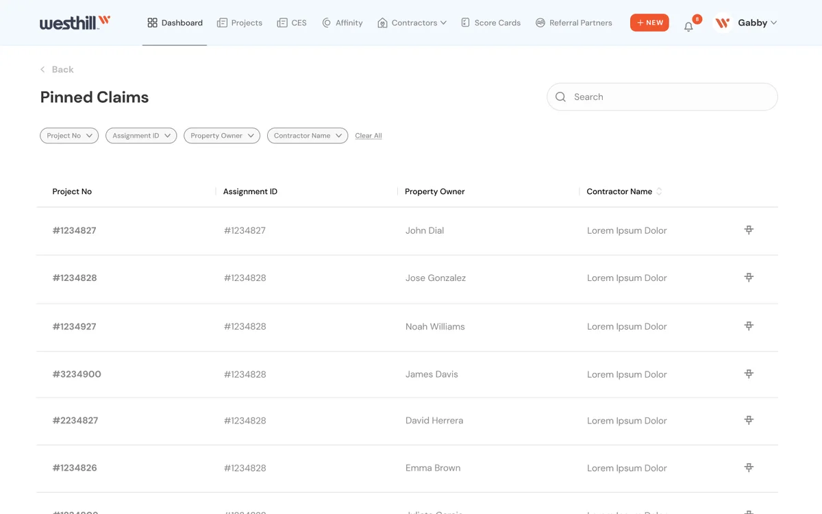
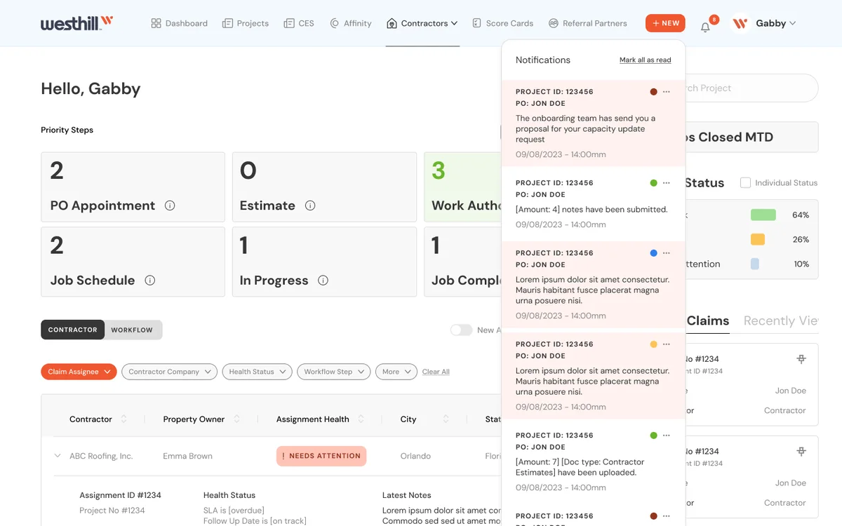
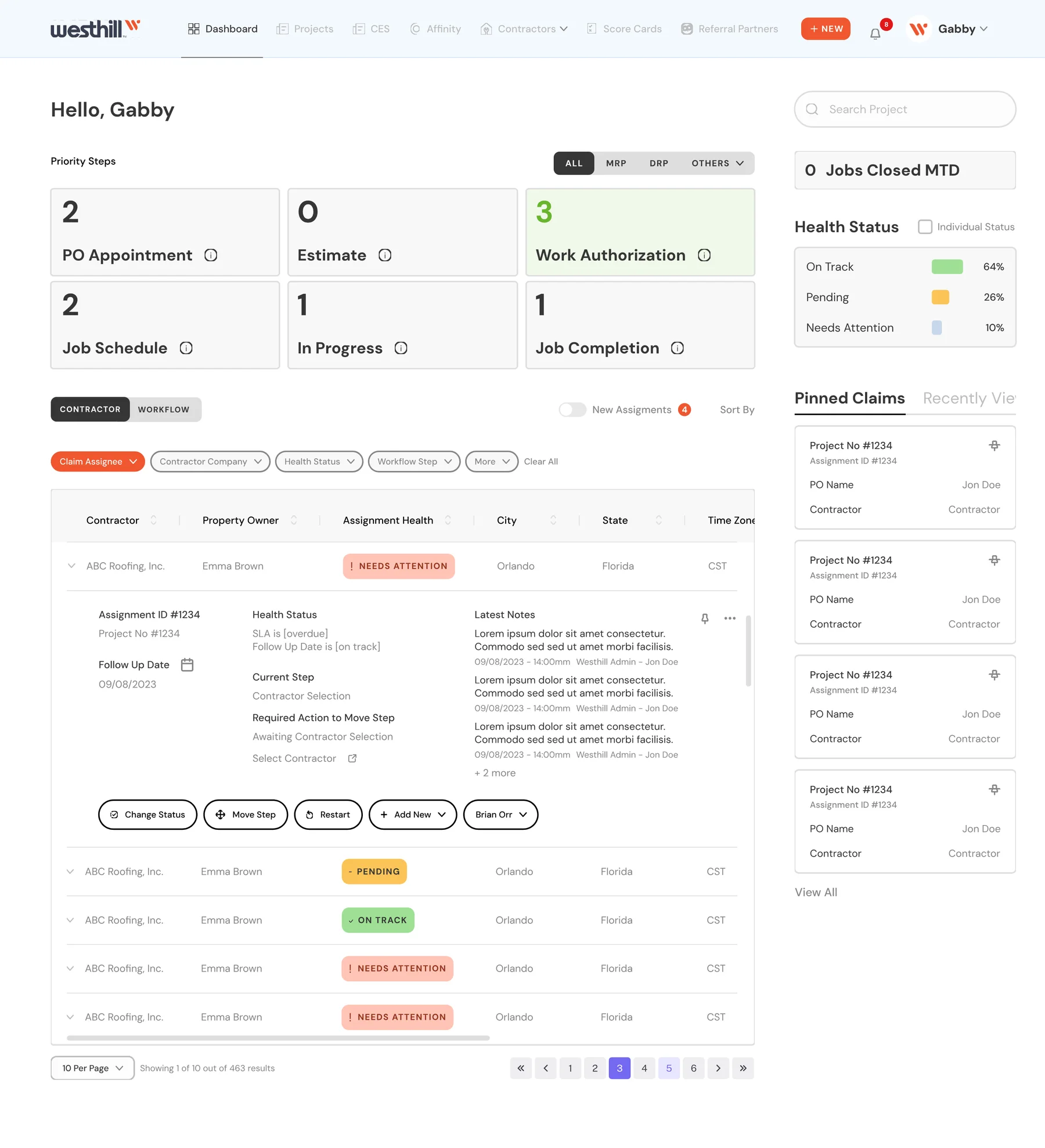
Operations dashboard: priority steps, health status, pinned claims and the assignments table
Client
A fully digital managed-repair platform connecting insurance carriers, homeowners and contractors (US)
My role
Main product designer, and design lead on partner collaborations
Length
1.5-year retainer
Partners
State Farm · Travelers · Nationwide · Farmers · Allstate
Platforms
Customer and contractor products · internal claims operations dashboard · design system · mobile app · contractor university · email flows
Outcome
Both products launched; the contractor side grew into a new product, a contractor university
01

The ask

The company connects homeowners, insurance carriers and a network of repair contractors. It wanted digital products that made a stressful moment simpler: something is broken at home, and the homeowner needs the right pro, fast.

02

The constraints

  • Three audiences with different goals: homeowners, technicians and contractors, and the partner carriers.
  • Partner brands: each carrier needed to see its own name, while the network's brand stayed visible.
  • Multi-step flows with branching logic, photos and edge cases.
  • Regulated, high-trust context: claims and insurance, where some copy and steps can't simply be removed.
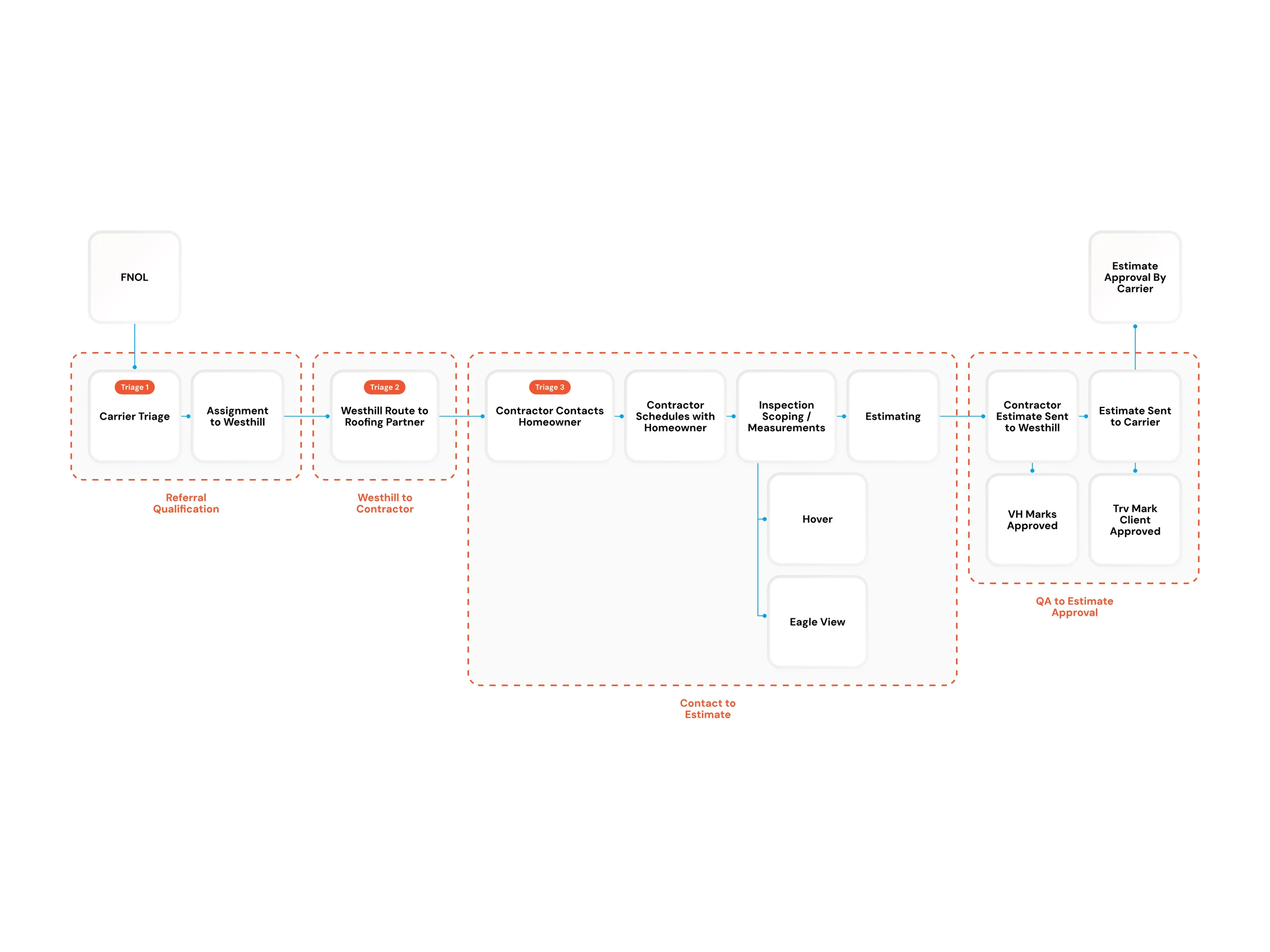
Workflow from first notice of loss to estimate approval, in four stages: referral qualification, routing to the contractor, contact to estimate, and QA to estimate approval
Workflow · from first notice of loss to approved estimate
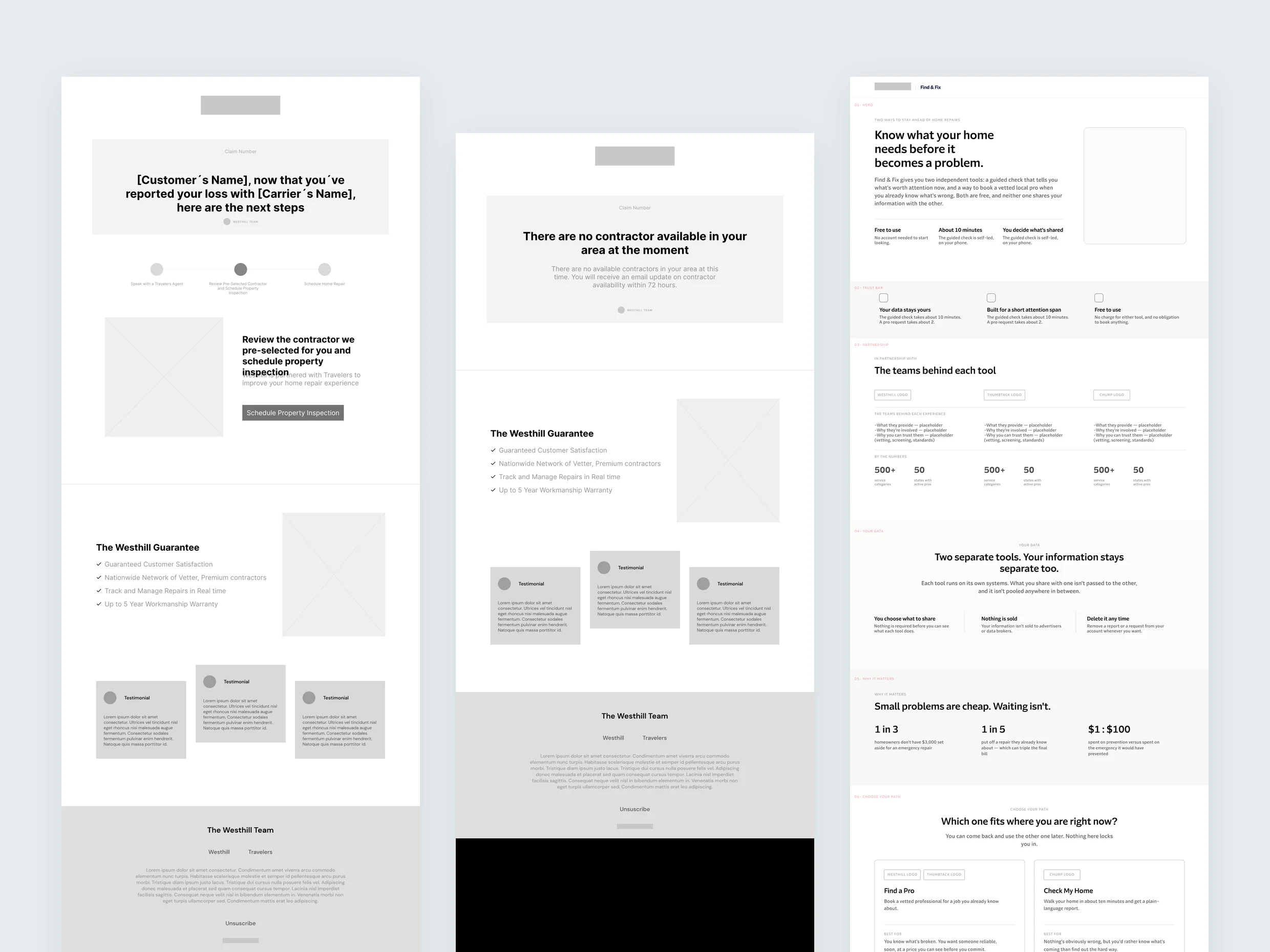
Wireframes: two homeowner emails and a carrier landing page
Wireframes · homeowner emails and a carrier landing page
03

Key decisions

Decision 1

One flow sounded simpler. Two scaled better.

The platform had to serve two sides with equal importance: customers and contractors. For both, the experience had to feel like a solution, not a burden.

I spent months mapping what each journey should feel like: communicative, with clear hierarchy, not too many clicks, and the right information in the most understandable way.

The client's original idea was one flow where people choose "customer" or "contractor." But each new partnership — with carriers like State Farm and Travelers — would make that single flow more complex. So I proposed launching separate versions instead: two products that stay aligned but never get mixed up.

We went with it, and it was the right decision. The platform reached a large audience, and the contractor community grew so much that it led to a new product, which I also designed: a university where contractors deepen their knowledge of the field and qualify for more jobs on the network.
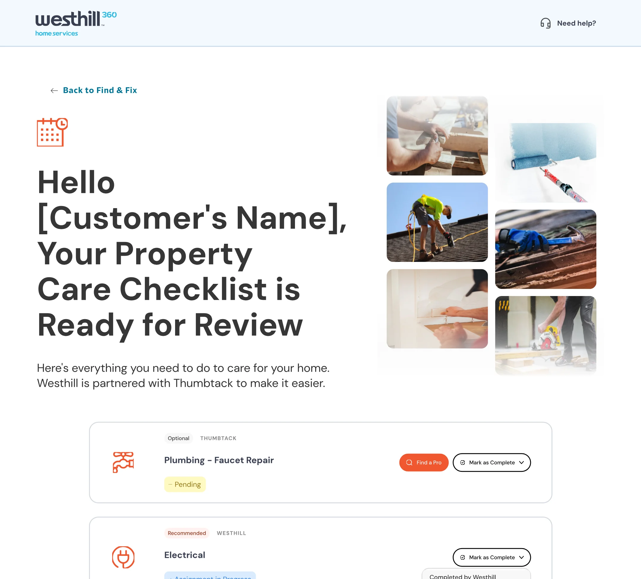
Westhill 360 customer page: property care checklist with plumbing, electrical, HVAC, roofing and tree removal tasks
Customers
Contractor dashboard: priority steps, health status, pinned claims and the assignments table
Contractors
Decision 2

In the partner room: listen, then suggest with visuals

When the network partnered with State Farm and Travelers, the team noticed I was a good mediator in meetings. So instead of handling each partner separately, they brought me into the weekly partner meetings, depending on the active projects.

There I learned what each partnership was meant to achieve, then designed materials for both sides — the network and each carrier — so their worlds and flows came together smoothly, visually and in the experience.

After that, every report or email shared with a partner became part of my work, because the team knew I understood what the partners needed and could deliver it. My value was as much in communication as in design and thinking.

Same process every time: listen, then suggest — with visuals, not just talk.

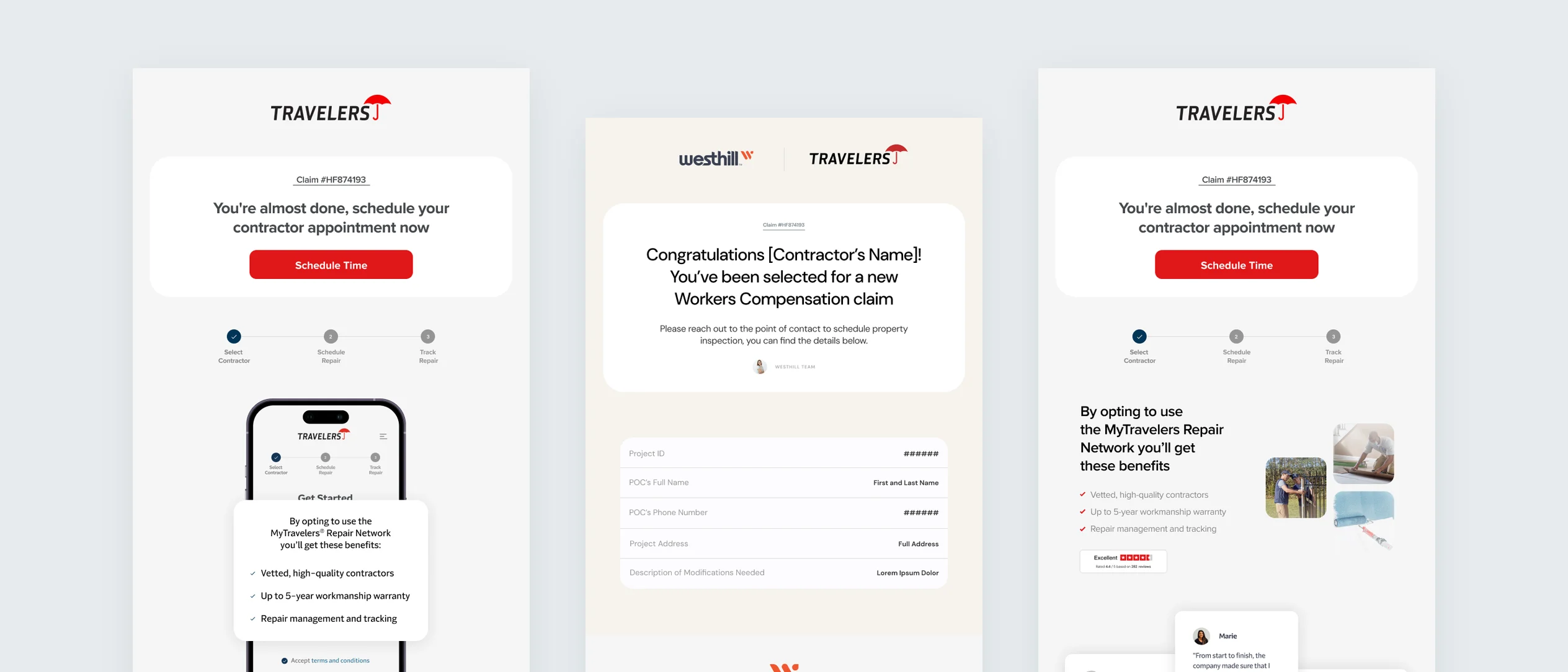
Three co-branded emails: a Travelers enrollment reminder, a Westhill and Travelers workers' compensation claim notice for contractors, and a Travelers scheduling reminder
Co-branded emails · Travelers and Westhill
04

The rest of the platform

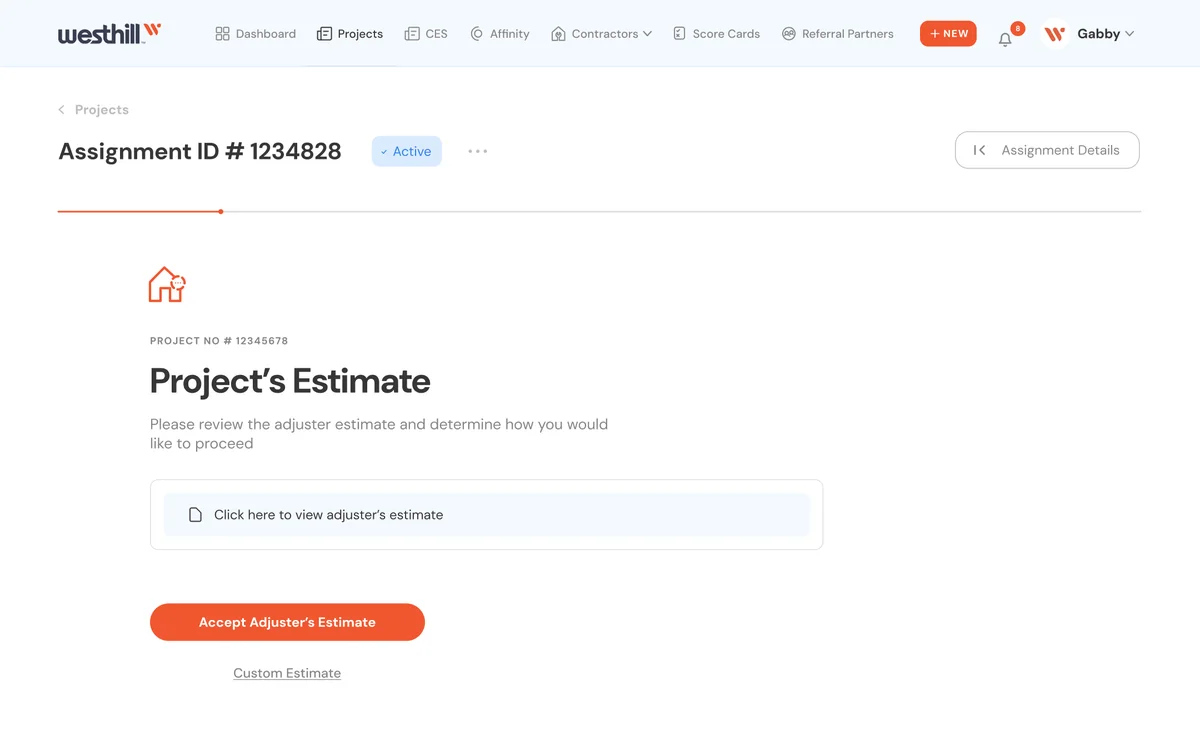
  • The contractor's side of every job: choosing start dates, booking the property owner's inspection, sending estimates and closing out the work.
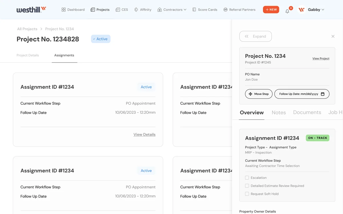
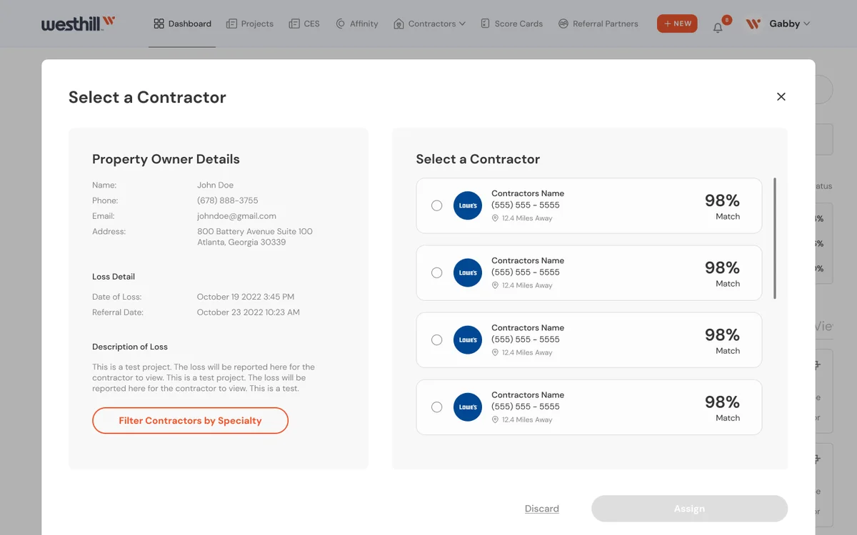
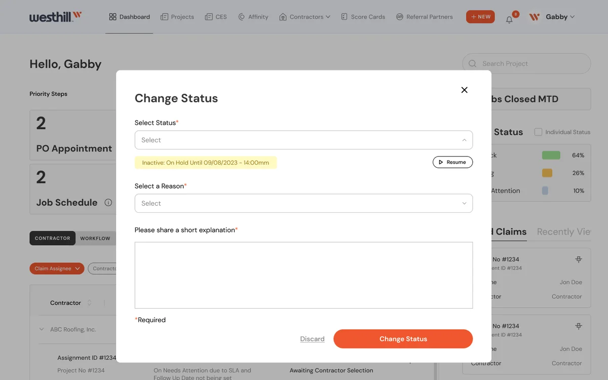
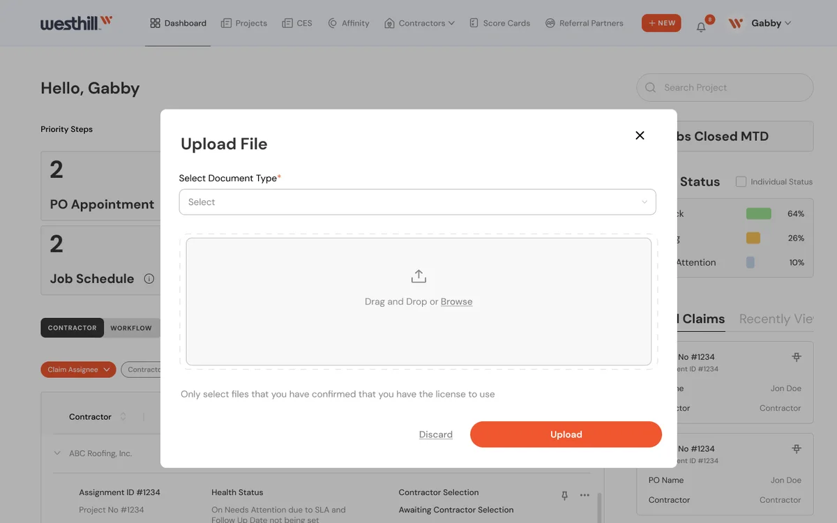
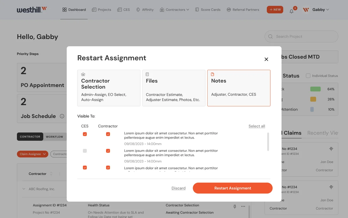
  • The operations dashboard the internal team works in all day: assigning contractors, changing statuses, files and notes, and cancel or restart requests.
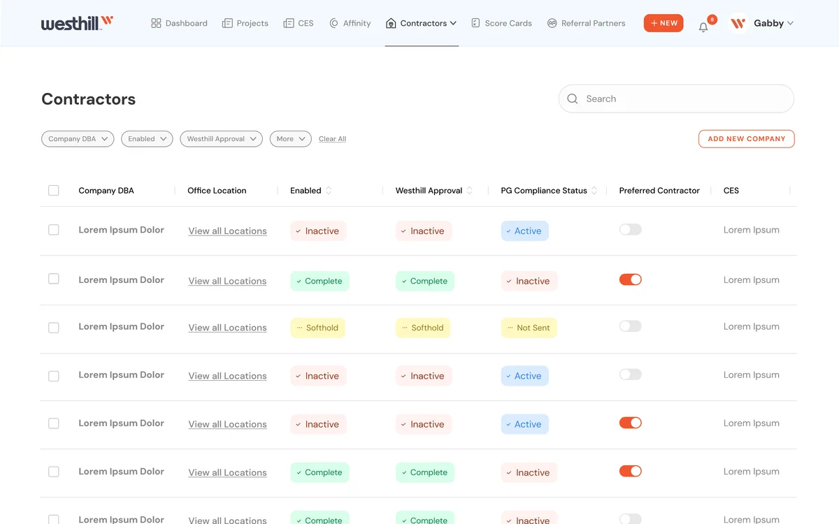
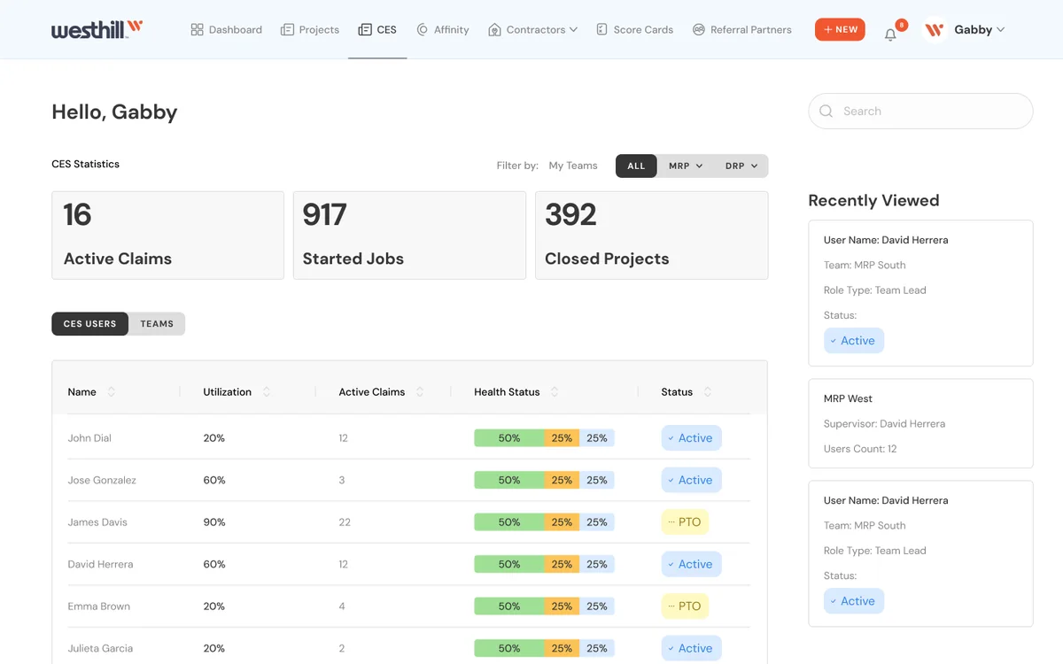
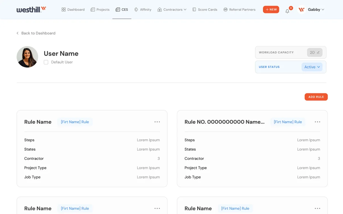
  • Managing the network: the contractor list, capacity update requests, the CES dashboard and jobs closed this month.
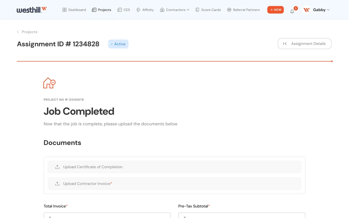
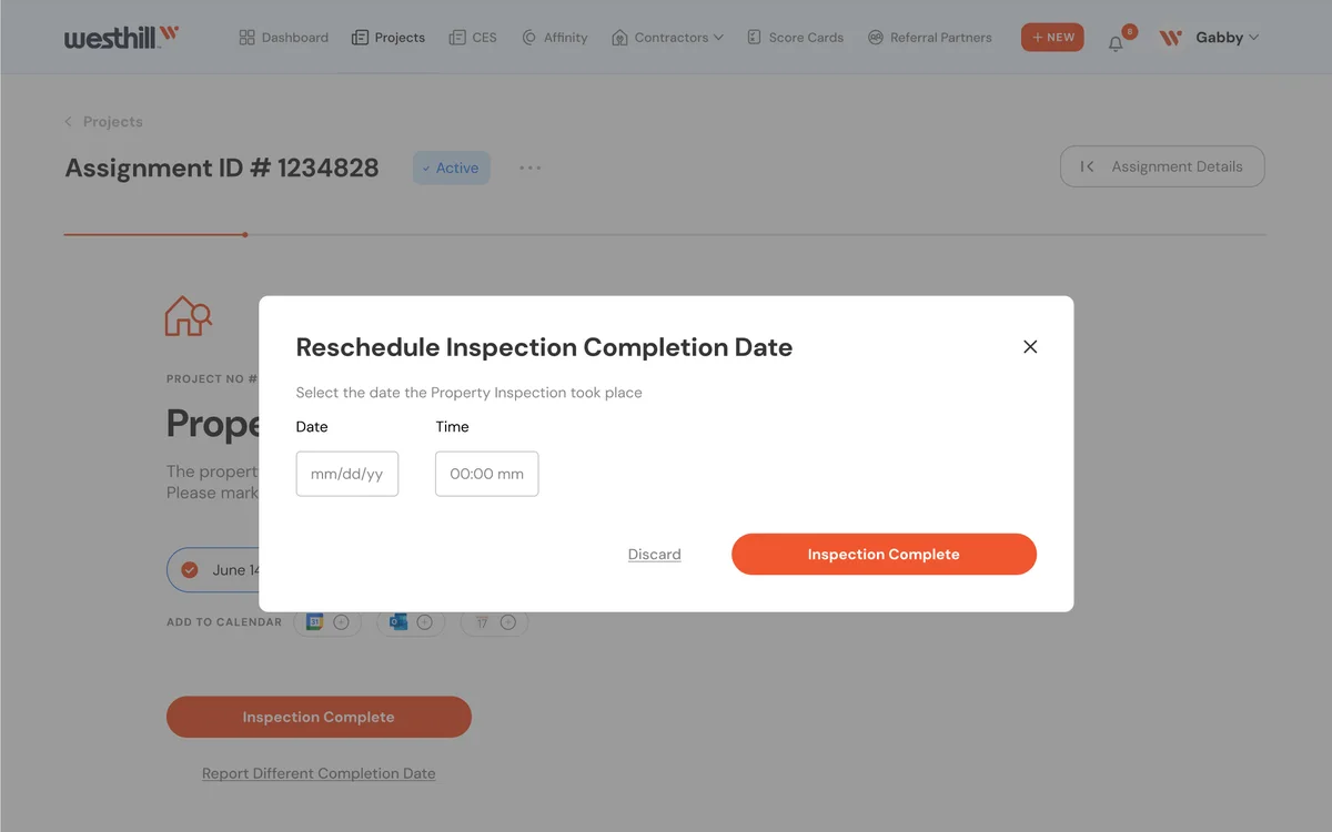
Platform screen: Job Completed:
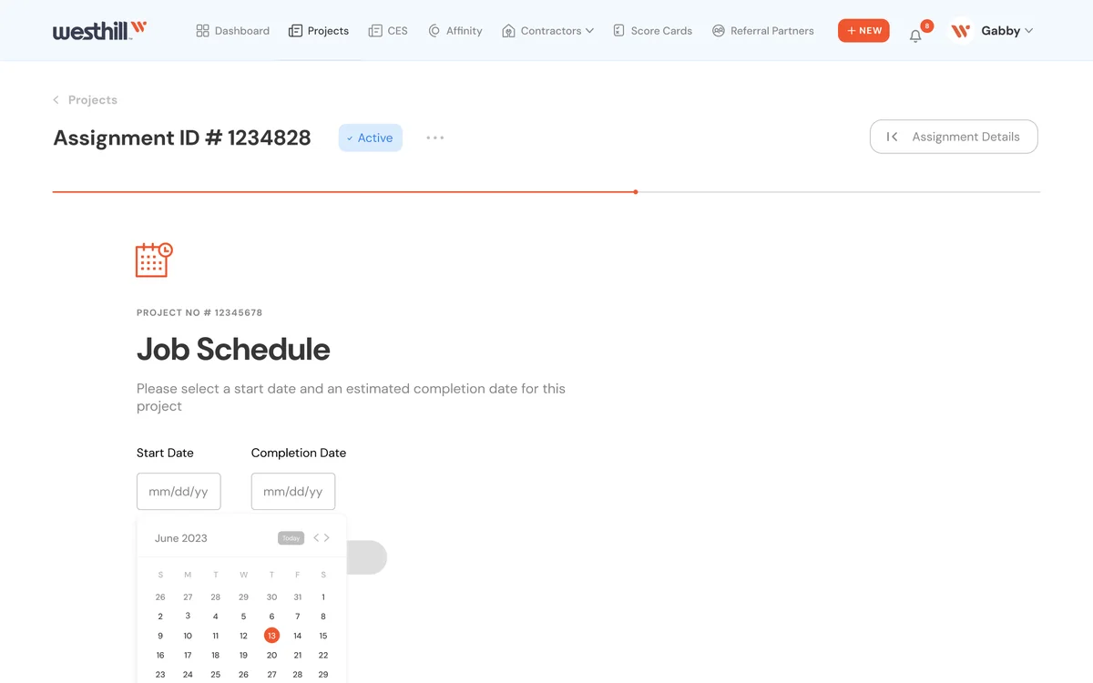
Platform screen: Job Schedule Select Start Date
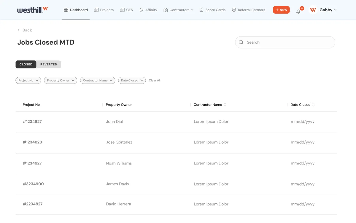
Platform screen: Jobs Closed MTD
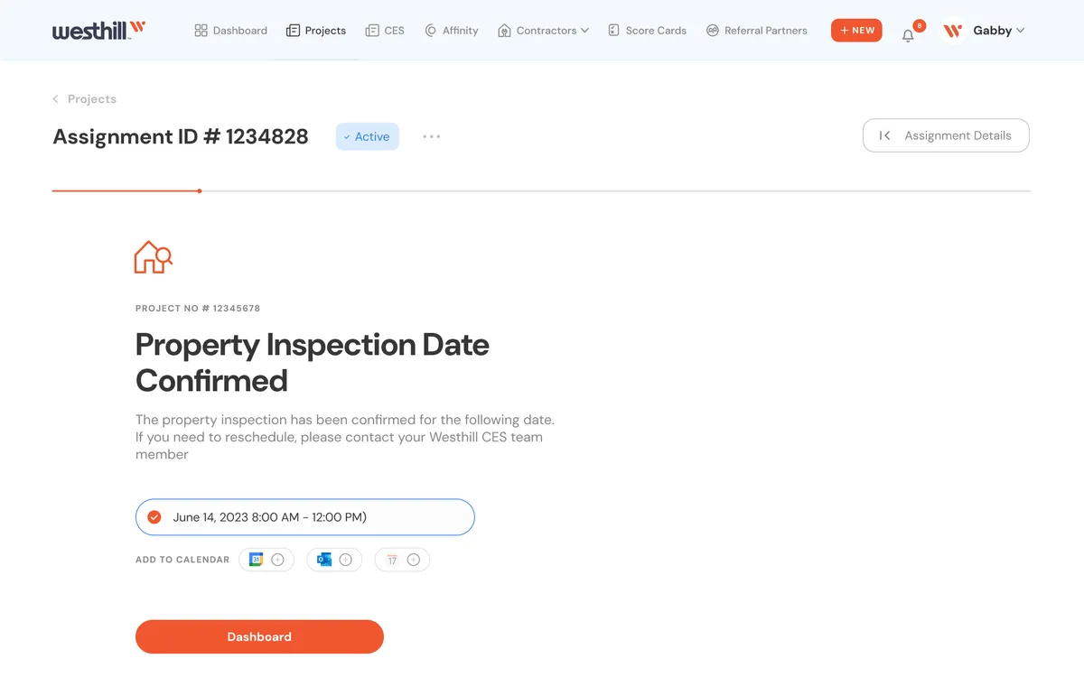
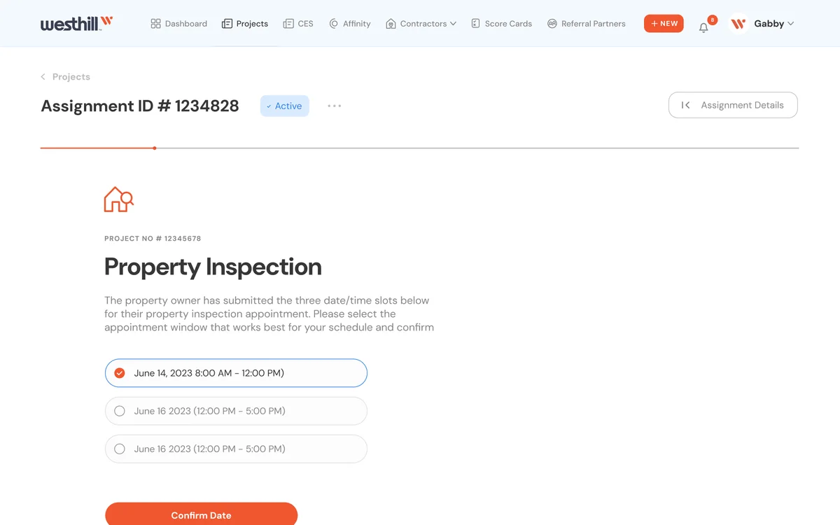
Platform screen: PO Appointment: Date Confirmed
Platform screen: PO Appointment: Day of Inspection
Platform screen: PO Appointment: Select date
Platform screen: Pinned Claim Full View
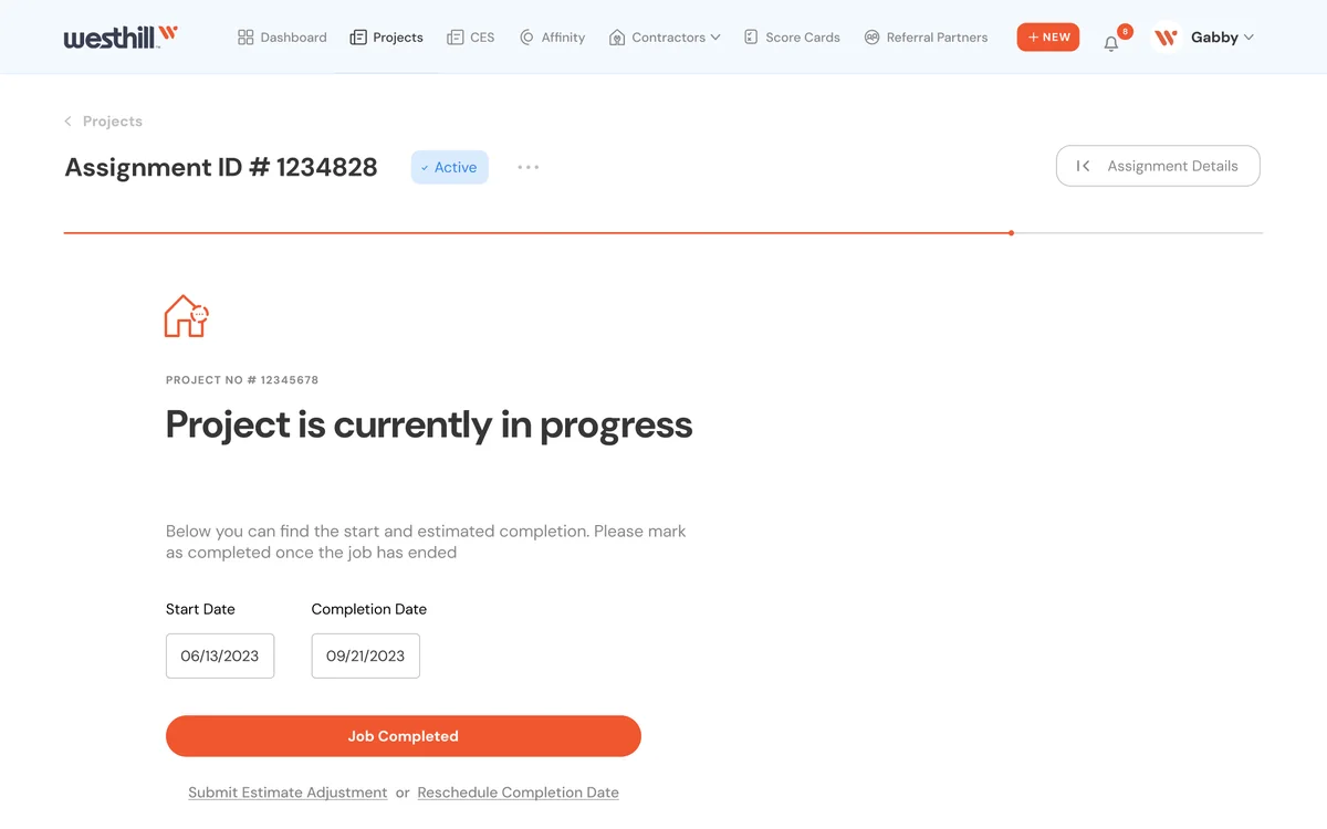
Platform screen: Project in Progress
Platform screen: Projects Detail View: Assignments: Open Sidebar
Platform screen: Dashboard: Contractor Capacity Update Request System
Platform screen: Contractors
Platform screen: CES Dashboard CES Users
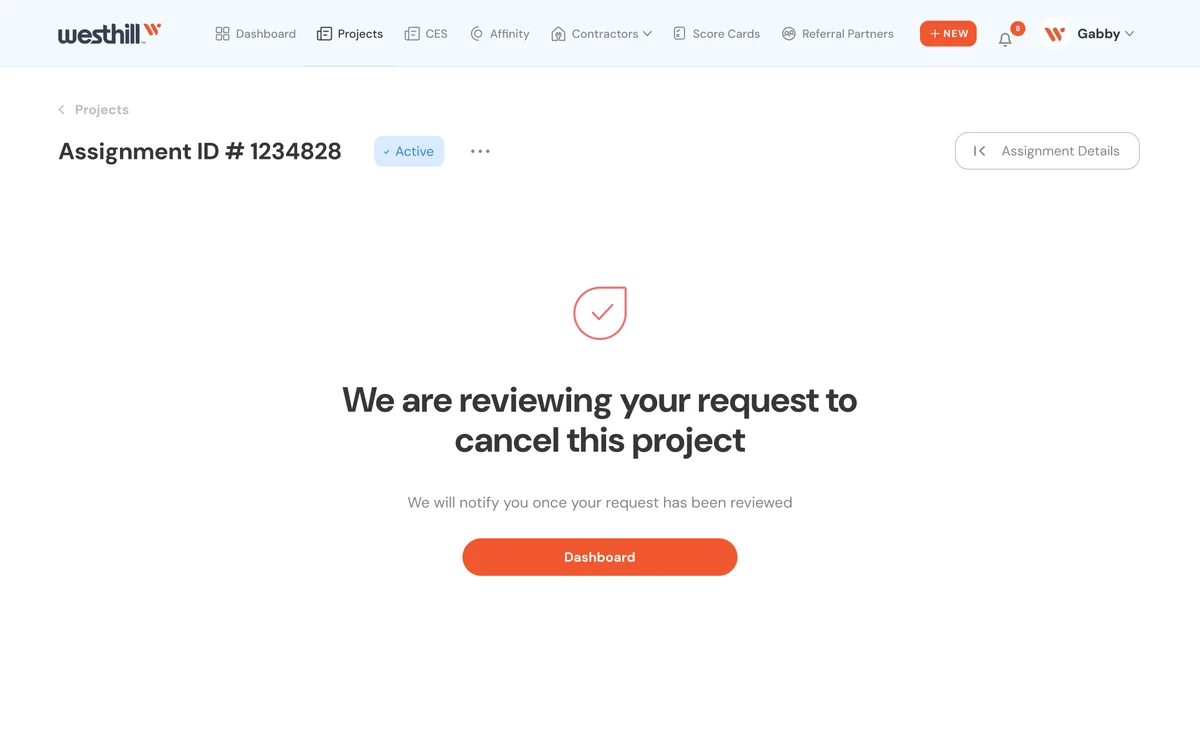
Platform screen: Assignment Internal View: Request to Cancel: Success Screen
Platform screen: Dashboard Admin Assign Pop Up:
Platform screen: Dashboard Change Status
Platform screen: Dashboard File
Platform screen: Dashboard Restart Assignment Notes
Platform screen: Estimate: Contractor Agrees with Adjuster
Platform screen: User
The platform · from scheduling to job completion
05

Outcome

  • Both products launched and reached a large audience; the company has grown significantly since.
  • The contractor side grew into a new product, which I designed: a university that helps contractors deepen their skills and qualify for more jobs.
  • I became a known name with State Farm and Travelers: on every collaboration, I was the designer and the mediator.
  • The client kept renewing: one well-delivered project led to the next, and they wanted me to stay on the retainer.
← Previous: Fintech Back to all work →